Sorry, we couldn't find any results for "null"
Search Tips
- Try the name of a collection or product
- Check your spelling
- Use a more generic keyword
Popular Searches
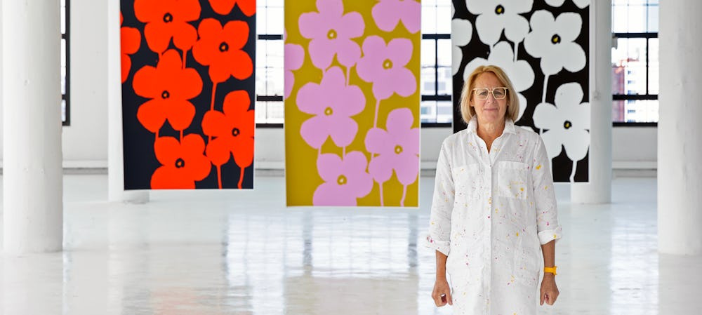
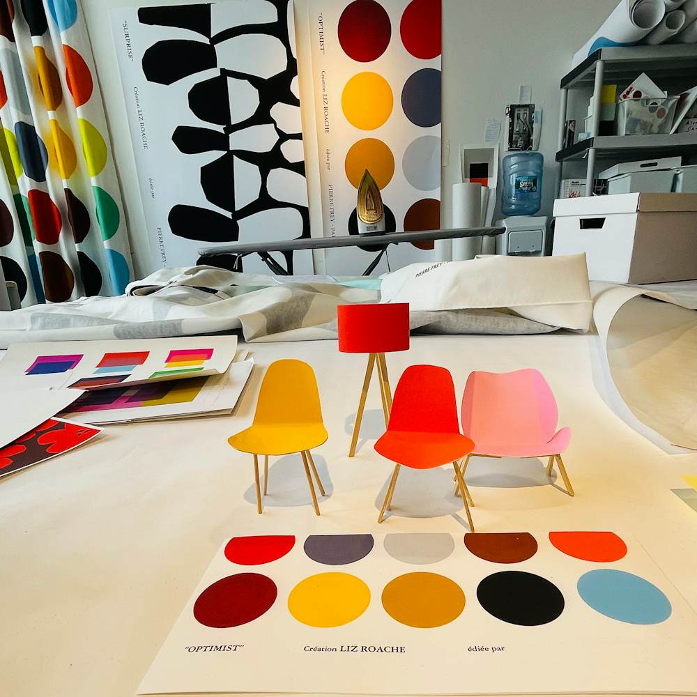
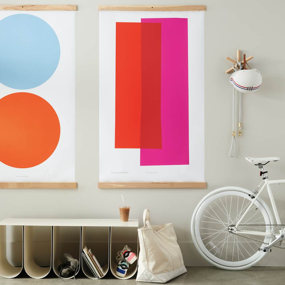
For artist Liz Roache, color is optimism, a source of beauty, and a medium for bold connections. Her fine art prints celebrate Bauhaus teachings by exploring color interactions that provoke conversation and find unexpected resonances.
Inspired by Josef Albers, Roache studied and worked for many years with Ati Gropius Johansen, daughter of Bauhaus founder Walter Gropius, and was chosen as her successor. “Ati and I talked constantly about color and design, topics that endlessly fascinated both of us,” says the Boston-based designer. Those influences guide Roache’s creative approach to both commercial and residential spaces, her teachings to corporate design teams, and her work and instruction in prestigious institutions around the world. Dedicating her life to color and design thinking led Roache to The Museum of Modern Art, where she has taught and designed exclusive products, The deCordova Museum in Massachusetts, and international design house Pierre Frey, where she has designed fabric, wallpaper, and rug collections.


Advice on using color
• Good color is all about good relationships. You can pair any two colors successfully if you tie them together with their middle mixture.
• Color is the personality in a room. We’ve all been in rooms with no color and no life. Start with a piece of art. A shot of color looks fabulous in neutral environments.
• Not sure where to begin? Look in your closet. The colors in a room should be the ones we look great in.
• To me, art is the most important player in a room. The bigger, the better. The amount of color should be larger than you are.
• Pay attention to which colors speak to you. When in doubt, go for it. Don’t choose a paint color and then back off two shades. When you walk into your space, you really want to say, ‘Ah, I’m home!’


